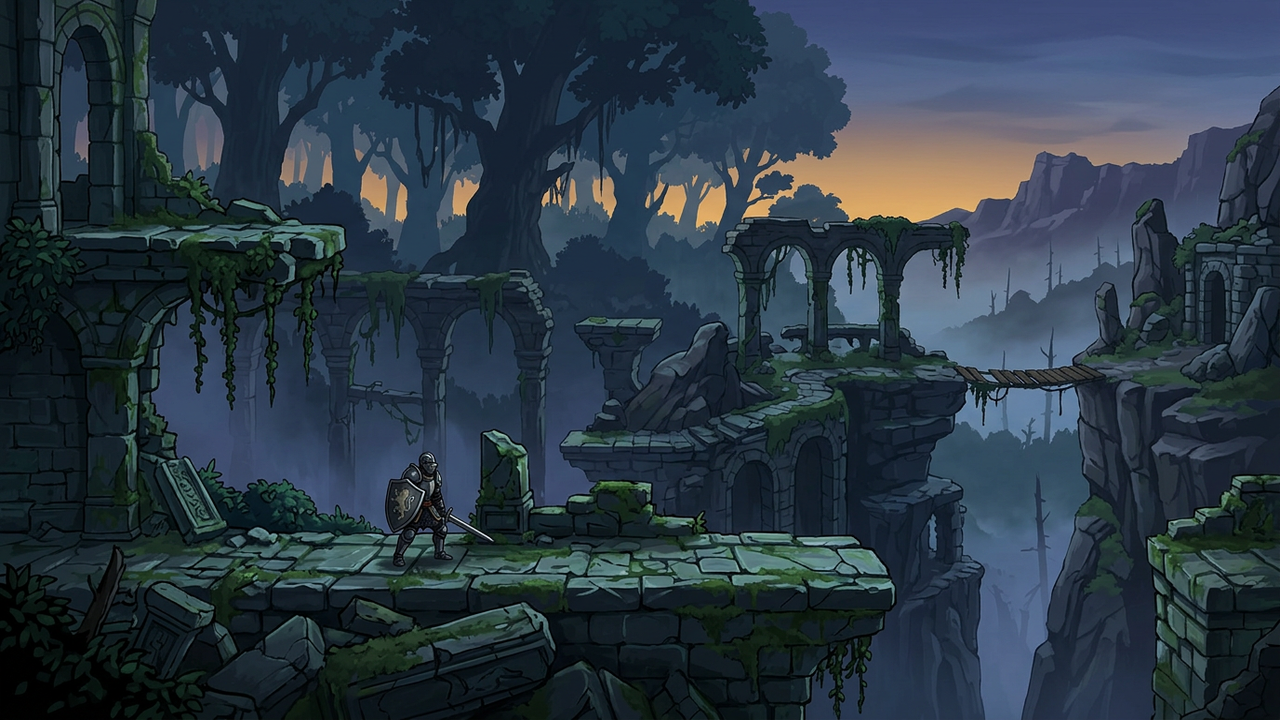
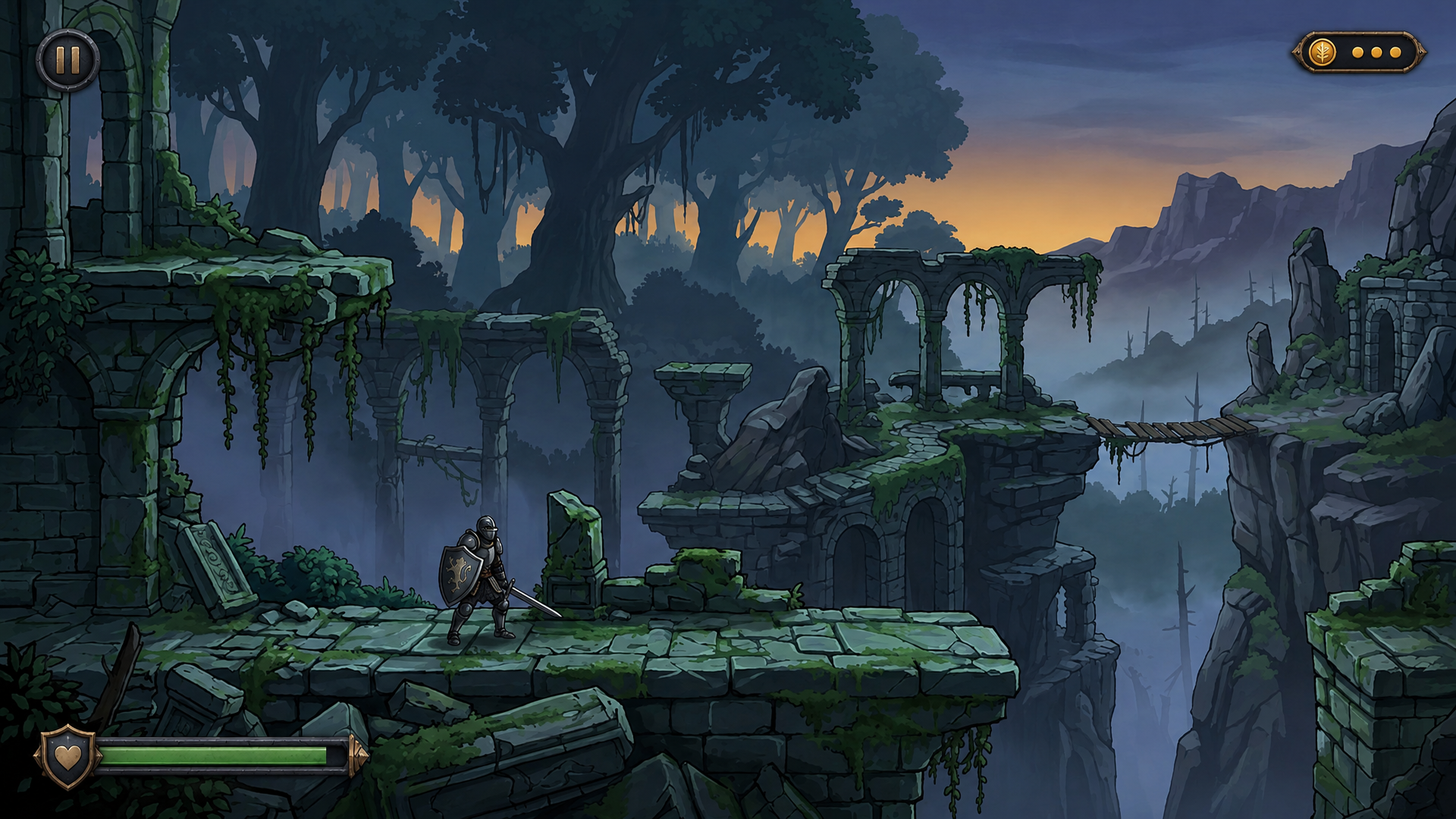
A HUD that looks right in a design file can fall apart on top of the game. It turns out too heavy for the art, or it sits right on the route the player runs, and usually you find out after it is built.
Attach a screenshot and list what the interface needs to show. The example on this page asks for a HUD "that fits the art style" and describes the style no further, because Layer takes the look from the image itself and mocks the interface up on your own frame.
Judge It Over Real Gameplay
Every HUD has to survive the busiest scene behind it. Put the mockup over your most crowded frame and you see at once what covers the action and what gets lost in the background, while it is still a picture and moving an element takes one sentence.
The Scene Stays Yours
Your art, left alone Layer adds the interface on top and leaves the scene as it was.
A style taken from the frame The HUD borrows what is already on screen, so it looks like part of the game instead of a template laid over it.
Placement follows the conventions players know. Counters and system buttons go toward the top corners, the player's own health sits low on the screen, and the center of the action stays open.
Once a layout is approved, ask for its widgets as separate files in their states for your engine.
See game HUD design for full widget sets, menu and store screens for full screens, and game UI kits for the pieces.