Shops, season passes and gacha screens carry a game's revenue, and they usually get decided in gray wireframes. Nobody can judge an offer until it sits in the game's own style, and by then a sprint has gone into building it.
Describe the screen and what it has to sell, and skip the wireframe. Layer lays it out the way players already expect for that kind of screen and renders it in your style with sample text in place, so the review looks at something close to the real thing.
The Offer That Matters Leads
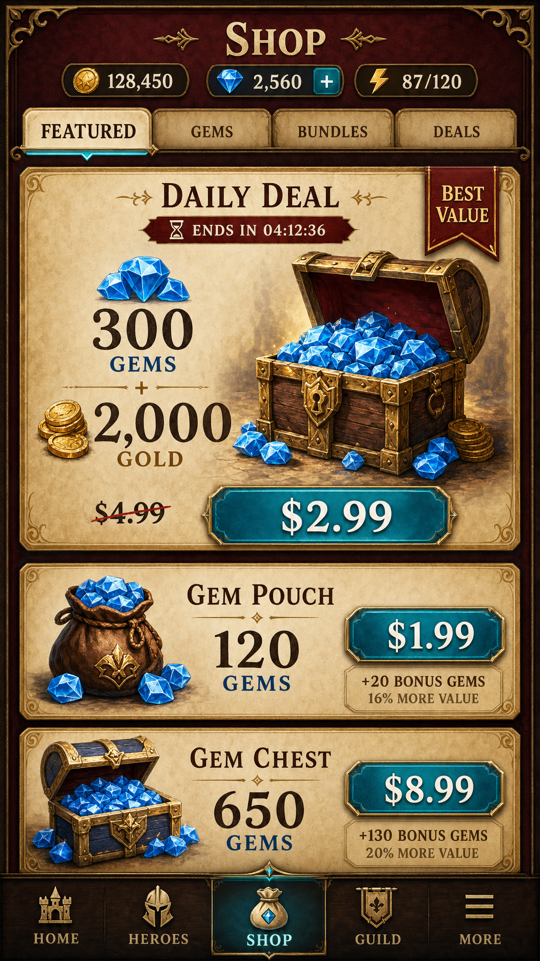
A store screen has one star and one main action. Layer gives the anchor offer the size and the emphasis and keeps the supporting offers quieter, because emphasis only works while it is scarce: badge every card and players stop seeing badges. The currency stays in view, and the button that spends it sits where the thumb lands.
Each Screen Has Its Own Grammar
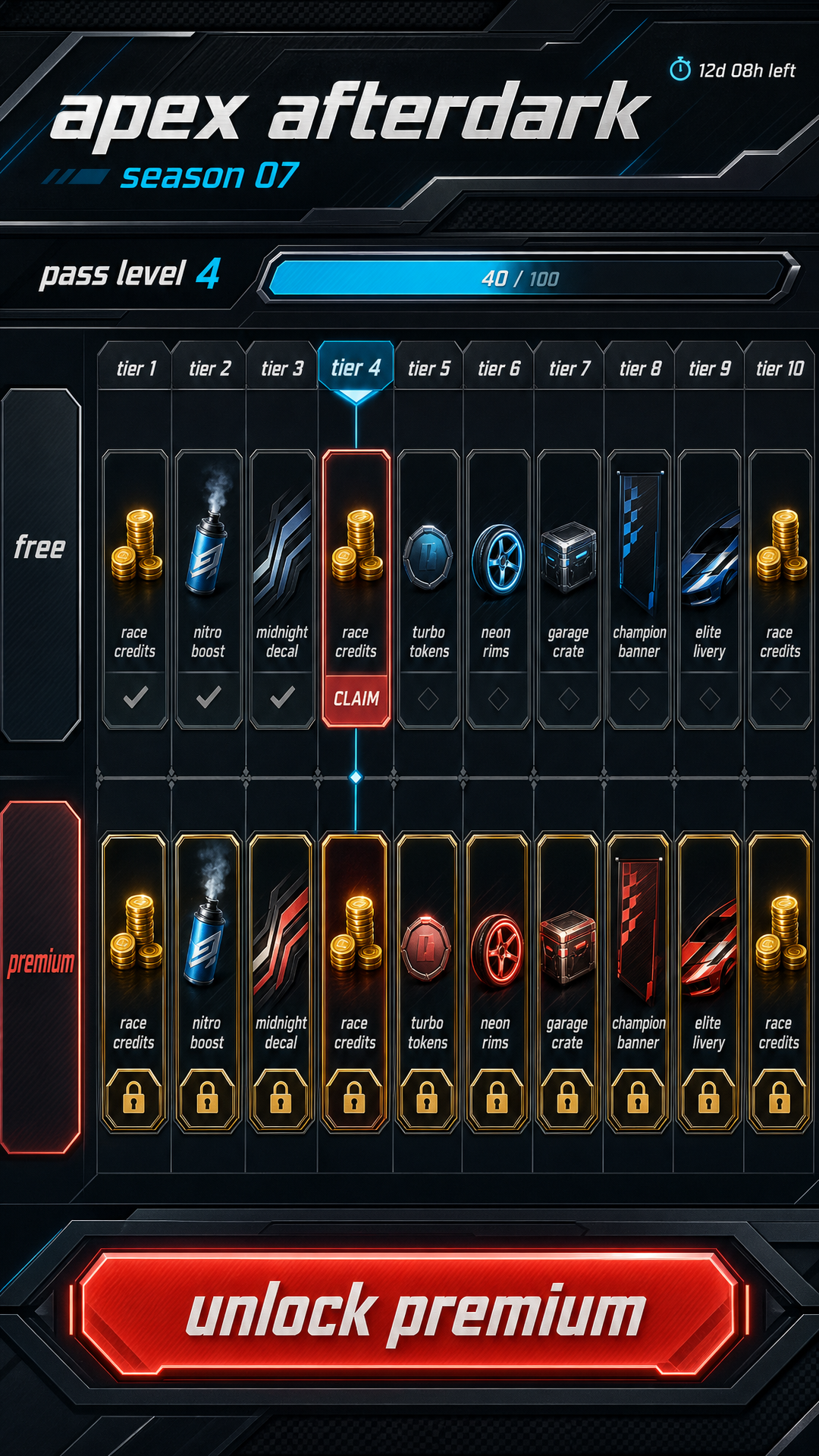
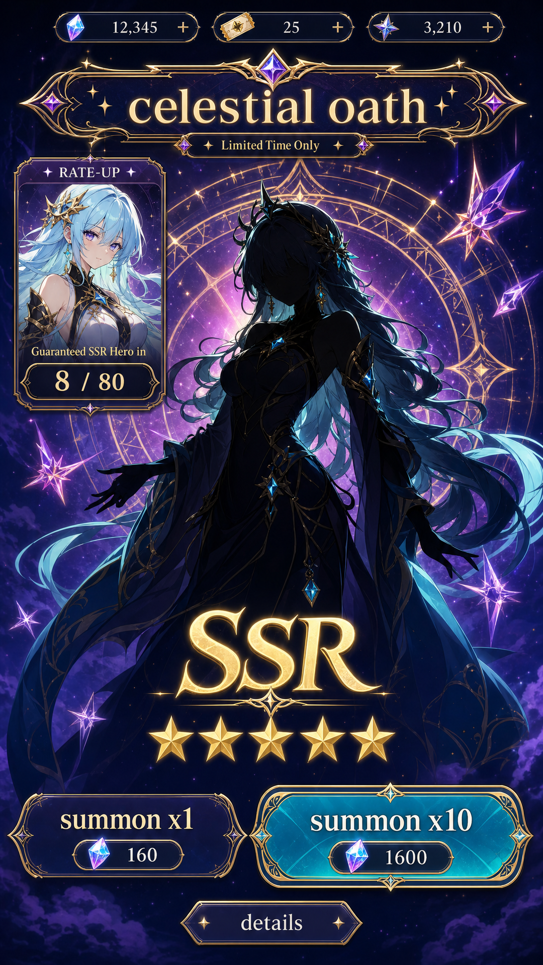
A shop opens on the deal of the day. A season pass runs a free lane and a premium lane on shared tier columns, and the premium rewards stay visible while locked, since the gap between the two lanes is the pitch. A gacha screen keeps the rate-up subject large and the summon buttons on the same screen as the showcase. Name the screen and Layer applies the convention that belongs to it.
When a Direction Wins
Mockups arrive as PNG files at your screen's resolution. Once one is approved, ask for its pieces as separate files and build from those.
For the pieces themselves, see game UI kits and game icon sets. For the in-play layer, see game HUD design.